
Bold Red Accents: A Game Changer for Interiors
- Marieke
- Feb 10
- 4 min read
Let’s talk about bold red. It’s one of those colours that always sparks debate in interior design - some adore its daring confidence, while others shy away, fearing it might dominate a space in all the wrong ways.

Personally, I fall into the second camp. I’ve never been a huge fan of primary colours like red; they often feel a bit too intense for my taste. My style gravitates towards softer, muted tones that create calm and balance, so when I do use red, I lean towards earthy terracottas or dusty burgundies rather than fire-engine red.
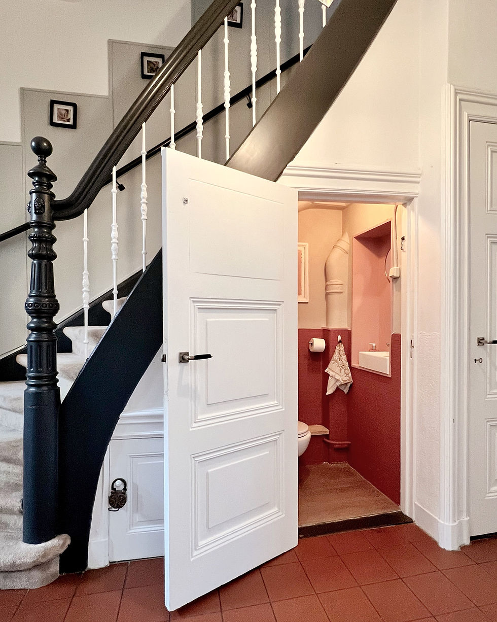
That said, I’ve learned to appreciate the magic red can bring to a space when used thoughtfully. I have applied it onto my own powder room. It’s a colour with undeniable presence, and when balanced just right, it has the power to turn a room from ordinary to extraordinary.
Red accents can inject energy, warmth, and a touch of drama, making a space feel vibrant yet refined.
In this post, I’ll show you how to make red accents work for your interiors - even if, like me, you tend to prefer a subtler palette. From selecting the perfect muted red tones to clever placement strategies, I’ll guide you through creating a look that’s bold but not overpowering, and always stylishly balanced.
The Sophisticated Side of Red
Let’s start with what makes red so impactful. It’s a colour that carries weight – psychologically and visually. Red evokes passion, energy, and confidence, but it’s also a master of creating focal points.
Think about it: a well-placed red chair or a single crimson vase can anchor a room and instantly draw the eye.

The trick lies in restraint. Overloading a space with red can feel overpowering, but introducing it in small, deliberate doses creates harmony. The secret? Knowing how much red is just enough.
If you're curious about mastering balance, my blog How to Create Harmony in your Home is packed with tips on creating visual interest without overwhelming the space.
How to Craft a Refined Red Palette
Not all reds are created equal. The shade you choose makes a huge difference in how your space feels. Bright, primary reds can be bold and attention-grabbing, while deeper tones like burgundy and terracotta exude warmth and sophistication.
Personally, I’m a fan of muted reds, as they pair beautifully with other colours and materials.
To create a refined palette, think about these combinations:
Neutral bases: Soft greys, taupes, or creamy whites provide a calming backdrop that lets red accents pop without competing.
Metallics: Incorporate gold, brass, or copper for a luxe feel. A red velvet cushion next to a gold lamp? Pure elegance.
Greens: Yes, opposites on the colour wheel attract! Olive or sage green complements red beautifully, creating balance.
Monochromatic layers: Experiment with a spectrum of red tones – from blush to deep maroon – for depth and cohesion.
To delve into colour pairings in more depth check out this post Infusing Warmth and Depth in Your Home with Analogous Color, if you’re looking for more inspiration.

Strategic Placement of Red Accents
Placement can make or break the impact of red in your space. Red is like a spotlight – it commands attention wherever it lands, so choosing the right areas is key. Here’s where I recommend focusing your efforts:
Entryways: First impressions matter. A red front door or console table can set the tone for your entire home.

Architectural features: Highlight built-in shelves, fireplace surrounds, or window frames with a touch of red to draw attention to these structural elements.
Furniture focal points: A statement chair, ottoman, or even a small stool in red can anchor a seating area and make the room feel cohesive.
Artwork: A piece of art with red tones can tie together other accents in the room without feeling overbearing.
A good rule of thumb? Keep red to about 20-30% of your overall design scheme. This ensures the colour feels intentional without dominating the space. Read more about the golden ratio here.
Bringing Red to Life with Texture
One of my favourite ways to incorporate red is through texture. Different materials and finishes can dramatically change how a colour feels in a room. A glossy red lacquered surface screams modern sophistication, while a matte, distressed finish feels rustic and cosy. Mixing textures adds depth and keeps your space visually interesting.
Here’s how to experiment with red textures:
Matte finishes: Perfect for creating a subtle, understated look.
Reflective surfaces: High-gloss paints, glass, or polished metals amplify red’s vibrancy.
Fabrics: Velvet is an obvious choice for adding opulence, but don’t overlook chunky knits, linens, or woven materials for a softer effect.
Patterns: Stripes, florals, or abstract prints with red accents can make the colour feel playful rather than overpowering.
If texture intrigues you, I’ve explored its impact further in my post on How to Use Texture in Interior Design.

Conclusion
Red accents have the power to elevate your interiors, but their magic lies in thoughtful execution. By choosing the right shade, balancing it with complementary colours, and placing it strategically, you can create a space that’s both bold and beautiful.
Whether it’s a crimson throw, a ruby-hued lamp, or a striking piece of art, these touches can make your home feel uniquely yours.
What are your thoughts on red accents? Have you used them in your home, or are you considering giving them a try? I’d love to hear your ideas and experiences - share them with me on social media!
For more interior design tips, inspiration, and exclusive updates, follow me on my social platforms and subscribe to my newsletter.


