
How to Choose a Paint Colour Scheme for your Home
- Marieke
- Mar 6
- 11 min read
Updated: 4 days ago
Choosing the perfect paint colour can feel like a challenge since everyone sees colour differently. In this blog, I’ll help you navigate the options and make thoughtful choices for a scheme that truly suits you.

A white wall is a wasted opportunity.
Colour Can Transform a Space
One of the easiest and most effective ways to completely transform a space is through colour. A fresh colour scheme can give a room an instant facelift - it’s relatively inexpensive, easy to do, and if you don’t love it? Worst case scenario, you paint it again! I always say, "a white wall is a wasted opportunity." But of course, that’s not entirely true.
White can be stunning - but only when it’s used with purpose and intent. Too often, people default to white simply because they don’t know what else to choose (also read: Choosing the Ideal White Paint for Your Interior). And hey, "anything goes with white," right? (Hands up if you’re guilty of this!)
Selecting the right interior paint colour palette is a challenge, and since colour is highly subjective, there’s no single “correct” way to approach it. You don’t have to rigidly follow design theories or the colour wheel to create a beautiful space.
What truly matters is choosing a palette that feels right to you - one that makes you happy every time you walk into the room.
Base your Interior Paint Colours on Less Flexible Elements
When planning a new space - whether it’s a new build, a renovation, or just a refresh—most people have a colour in mind from the start. But here’s a tip: resist the urge to pick your paint colour first!
Since paint is one of the most affordable and adaptable design elements, it should be chosen last. Instead, start with the features that are harder to change - think furniture, fabrics, tiles, or wallpaper. Once those are in place, you can select a paint colour that ties everything together seamlessly.
Resist the temptation to select the paint colour first.
I’ve made this mistake myself. We picked out a gorgeous sofa in the shop - well, hubby picked it, so naturally, I’ve blamed him ever since. The fabric was lovely, we both loved it, and since sofas aren’t exactly cheap, it felt like a solid investment.
But did I check if the fabric swatch worked with our (then) green walls? Nope. Did I regret it? Absolutely. It wasn’t a disaster, but something always felt slightly off. If I’d taken a moment to compare the two properly, I probably wouldn’t have changed the entire colour scheme - just adjusted the tone of either the paint or the fabric.
In the end, that sofa (and those walls) are long gone, but the lesson stuck with me. Now, I always test colours together before making a decision - something I highly recommend!

As I mentioned earlier, colour has the power to completely transform a space - it sets the mood, defines the style, and gives a room its personality. Whether you want a space that energises, inspires, welcomes, or soothes, the key is to choose a colour palette that feels like you the moment you walk through the door.
It should make you happy. And to do that, the colours need to be well-balanced and inviting. Finding the perfect palette isn’t just about picking shades you like - it helps to have a basic understanding of colour and how it works in a space.
Take Note of the Colour Wheel
Now, I’m not here to give you a full-on colour theory lesson - that’s not the point of this blog. But having a basic understanding of the colour wheel can definitely help (though it’s not the holy grail of design decisions).
The colour wheel visually arranges hues based on their wavelengths, showing how colours relate to each other. It helps you understand the connection between primary, secondary, and tertiary colours and, more importantly, which ones will work well together.
When creating a colour palette, less is often more - aim for no more than three or four hues. If you’re unsure where to start, take a look at a colour wheel and let it guide you toward harmonious combinations.

The primary colours - red, blue, and yellow - are the purest of the bunch. You can’t create them by mixing other colours together. Secondary colours - orange, green, and purple - come from mixing two primaries in equal parts. Tertiary colours are a step further, blending primary and secondary colours in different proportions to create more nuanced shades.
You might also hear the term hue, which is just another word for colour. But not all colours are created equal - there are tints, tones, and shades that give hues their depth.
Tints (think pastels) are colours mixed with white, shades have black added, and tones are a mix of both white and black, softening the colour without making it too light or too dark.
Methods for Creating Colour Schemes: Colour Harmony Groups
The colour wheel helps bring a bit of structure to the way colours are combined, making it easier to create balanced and visually appealing schemes. Take a monochromatic colour scheme, for example - it’s built around one colour in different tints and shades (not just black and white, as some might think).
Then there’s the analogous colour scheme, which uses neighbouring colours on the wheel, like red, orange, and yellow. These types of arrangements fall into what we call colour harmony groups - combinations that naturally work well together.
Colour harmony is what makes certain colour pairings pleasing to the eye. It’s all about balance, contrast, and how colours interact with one another. Harmonious combinations can follow different formulas, such as monochromatic, complementary, split-complementary, triadic, tetradic, square, or analogous - each offering a different dynamic and mood for a space.

You can dive deep into colour theory, experiment with different harmonies, and play around with schemes to your heart’s content. If you’re looking for a helpful tool, Adobe’s Colour Wheel is a great way to create your own colour schemes based on specific harmony groups.
Personally, I find myself naturally drawn to complementary colour schemes - they just feel right to me and create a sense of balance. That doesn’t mean I always start with a fixed idea in mind, though.
In my experience, people often get caught up in trying to force their choices into a specific harmony group, worrying about whether their scheme is ‘correct’ according to theory. But when you focus too much on the technical side, you risk missing the most important aspect of colour - how it makes you feel.
So, what does your gut tell you? Does this scheme feel right? Colour preferences are deeply personal, and at the end of the day, that matters more than whether or not they fit into a textbook definition of harmony.
Find Inspiration for your Interior Paint Colour Scheme
Worried about nailing the perfect colour scheme? Don’t be. The goal isn’t perfection—it’s about exploring colours in new ways and finding combinations that speak to you. Instead of starting with traditional colour wheel harmonies, why not flip the process around?
One of the easiest ways to build a colour scheme is to take inspiration from something you already love. It could be a piece of artwork, a beautiful rug, a favourite photo, or even a fabric pattern that catches your eye.
Nature, in particular, offers some of the most stunning colour combinations. Think about the soft blues, greens, and warm yellows of a beach scene for a calming analogous palette. Or the vibrant complementary mix of red and green with soft pink accents found in a flower. Even something as simple as a beautifully plated dish or the colours of a sunset can spark the perfect palette for your space.
I have decorated an entire home with the help of goose feathers. Pay attention to the proportions of each shade to recreate a similarly balanced colour scheme.

Another easy way to explore colour schemes is to start with a few colours you’re drawn to and then Google colour palettes based on those combinations. You’ll find endless images with ready-made palettes that can serve as inspiration.
From there, you can tweak and refine them to create a scheme that feels right for your space. Sometimes, seeing colours paired together in unexpected ways is all it takes to spark the perfect idea!
Easy Way to Draft Your Interior Paint Colour Scheme
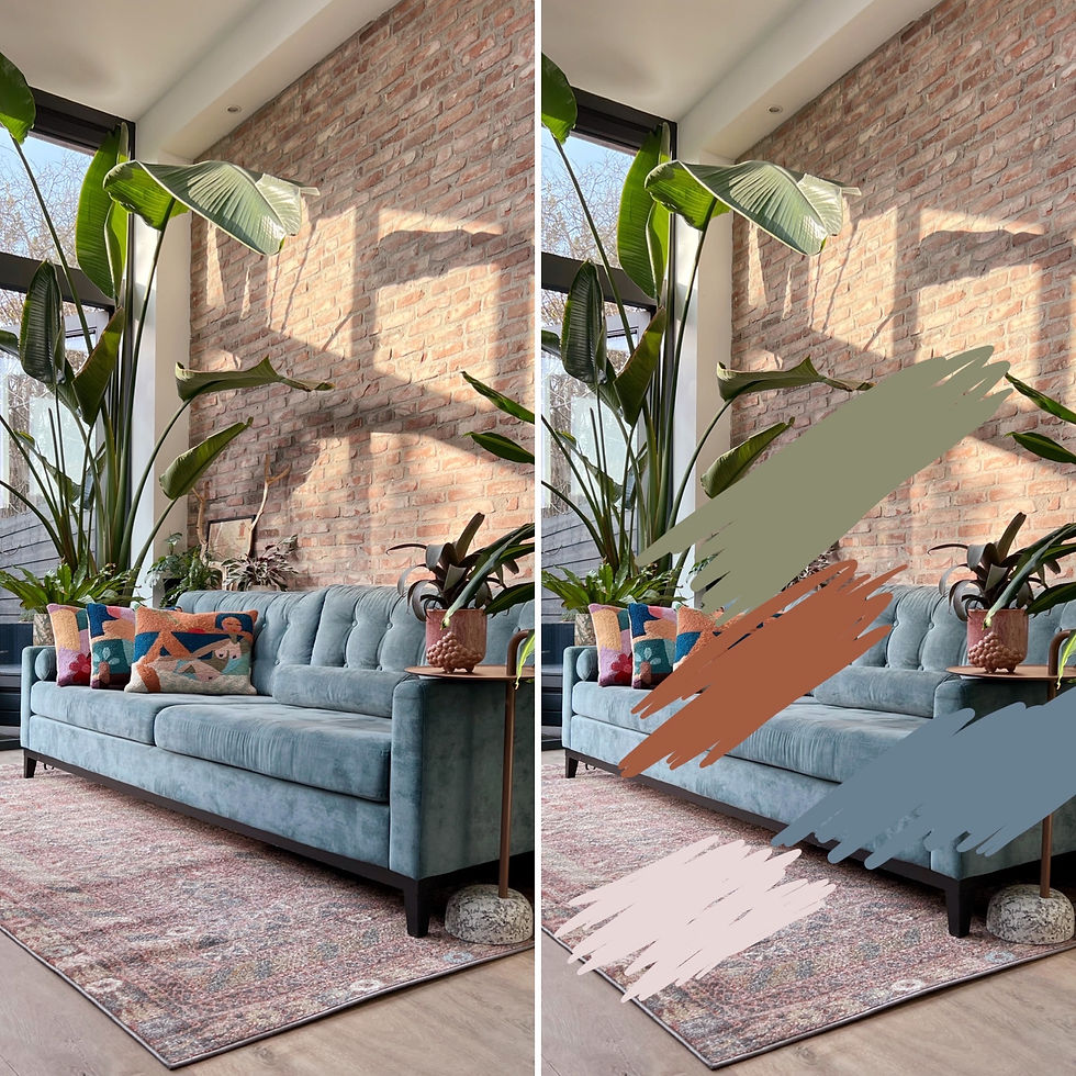
Did you know that creating a colour scheme from your favourite image is surprisingly simple - right from your smartphone? Let me show you how.
I took a picture of my blue sofa against the exposed brick wall in my home. Using the markup tool on my iPhone, I selected colours with the colour picker tool and brushed them onto the image. Within minutes, I had a basic colour palette that I could refine further by matching it to actual paint swatches and adjusting the tones as needed.
You can do this with any image that inspires you - a favourite fabric, a landscape, or even a meal that caught your eye. It’s a quick and creative way to visualise a colour scheme before committing to paint!
Use a Coherent Colour Scheme for the Entire House
This doesn’t mean every room needs to be painted the same colour, but there should be a sense of connection - a natural flow from one space to the next. A well-thought-out palette creates a cohesive feel throughout your home while still allowing each room to have its own personality.
Think about how one space transitions into another, the mood you want to create, and how existing elements like furniture and flooring tie into the overall scheme. A simple trick for an easy whole-home palette is to use one key colour in varying proportions across different rooms - perhaps as a wall colour in one space and an accent in another. This approach keeps things visually interesting while ensuring everything feels harmonised.
Consider How Light Affects Colours
Lighting plays a huge role in how colours appear in a space. Since colour is essentially a reflection of light, both natural and artificial light can dramatically shift how a hue looks on walls, fabrics, and furniture throughout the day.
Natural light is often considered ideal because it evenly spreads across the visible spectrum, but it’s constantly changing. Morning light is soft and cool, midday light is bright and neutral, and evening light is warm and golden.
If a room has northern exposure, it will receive less natural light and might feel cooler - making a warm colour palette a great choice to soften shadows and add warmth.
Meanwhile, rooms flooded with sunlight may make colours appear brighter or more intense than expected.
To avoid surprises, spend time in the room at different points of the day and observe how the light interacts with your chosen colours. The same shade can look entirely different from one space to another, and subtle nuances between similar shades may disappear altogether, making the colour feel slightly ‘off.’
When in doubt, always test paint swatches on the walls and check them in morning, afternoon, and evening light before committing!

How Artificial Light Affects Colour
Artificial lighting plays a huge role in how colours appear, especially in rooms used primarily before sunrise or after sunset. Incandescent lamps emit a warm, reddish light, making colours appear richer and more golden. Fluorescent lighting, on the other hand, tends to be cooler and bluer, which can mute warm tones and enhance cooler shades.
When choosing colours for a space that relies heavily on artificial light, always test them under the actual lighting conditions in that room. A shade that looks perfect in daylight might feel completely different under warm or cool artificial light.
Also, keep in mind that colours with white in them are highly reflective - they pick up surrounding hues from flooring, ceilings, and even furniture. A white wall, for example, won’t always look purely white; it may subtly shift depending on the other colours in the space. Always consider the full environment when making your final selection!
Use Colour to Help Define Your Space
In an open floor plan, where multiple areas flow into one another, choosing a colour scheme can be a bit trickier. As I mentioned earlier, there should be a sense of cohesion between spaces, but that doesn’t mean everything has to be the same colour.
Colour is a great tool to subtly define different zones within an open space. You can create separation by adding moulding and painting within that framed area to introduce a block of colour. If endless walls feel overwhelming, break them up with a bookcase, shelving, or a decorative screen to add structure.
And if colour blocking feels like too big of a step, a well-placed rug can define a space just as effectively while keeping the palette harmonious.

Let Architecture Guide Colour Transitions
When transitioning between colours in an open space, let the architecture do the work. Use corners, alcoves, or natural transition points as logical places to stop and start a new paint colour or wall treatment. This keeps the flow feeling intentional rather than abrupt.
Feature walls can also be a great way to define different zones or highlight an architectural element. A bold accent wall can draw attention to a fireplace, built-in shelving, or a dining area, giving each space its own identity. Just be mindful - too many feature walls in an open plan can dilute their impact. Keep them purposeful and balanced to maintain a cohesive design.
Be Brave: Choosing Paint Colours Is Not a Lifelong Commitment
It’s just paint—so don’t be afraid to experiment! While neutrals feel like the safe choice, introducing colour can completely transform a space. It can tie together mismatched furniture, refresh outdated pieces, and bring new life to a tired room.
Even a small pop of unexpected colour - on a door, ceiling, or piece of furniture - can take a space from ordinary to effortlessly stylish and personal. And if you change your mind? You can always repaint!

Use Colour to Manipulate Space
Colour isn’t just about aesthetics - it can completely change how a space feels. Light colours can make a small room feel larger, while darker shades can create a cosier, more intimate atmosphere in a big space. If you want to visually lower a ceiling, a darker hue will do the trick, while a lighter shade can make it feel higher and airier.
If you prefer a neutral colour scheme, layering different shades of the same hue adds depth and sophistication without feeling flat. This approach allows natural materials like wood flooring, trim, ceiling beams, and even brick or stone to stand out beautifully, bringing warmth and texture to an understated space.
Explore the Beauty That Colour Can Bring to Your Space
Anyone who has ever searched for the perfect room colour knows—it can feel like navigating a minefield. With endless choices and subtle nuances to consider, it’s easy to feel overwhelmed.
If you tend to stick to neutrals or soft pastels, the idea of decorating with bold colours might seem intimidating. But colour has the power to transform a home, setting the mood and reflecting your personality. For every style and taste, there’s a perfect colour scheme waiting to be discovered.
So, push aside any doubts and be open to exploring the beauty and impact that colour can bring to your space - you might just surprise yourself!

Take It One Room at a Time
If diving into colour feels daunting, start small—experiment with one room and see how it turns out. Worried you might tire of your chosen palette or that today’s trendy shade will feel outdated tomorrow? Then let your home’s architecture guide you.
Consider the era and style of your home. What architectural features stand out? Is your space more urban or country? Colours that complement the home’s original character tend to feel timeless and won’t date as trends come and go.
Colours that complement the era of your home won't date.
Enjoy exploring the wonderful world of colour! Read all my blogs on colour here for more inspiration, and if you take the plunge, I’d love to see what you create. Tag me on Instagram and show off your colourful transformations.

