Spanish Home Office Makeover
- Marieke
- May 28, 2021
- 5 min read
Updated: Oct 29, 2024
Urban Mediterranean with a touch of country
Urban Mediterranean with a touch of country; I think that's how I should label my interior design style of our house in Spain. Not that I like labels. On the contrary, I do what I like and whatever feels right. I have a penchant for the unconventional and certainly do not like to be placed in a box.
I really don't really care about following trends, I rather set my own. But you can always find certain fixed elements in my style, and that is respecting and honouring vintage elements combining them with modern touches, being true to the character of the house, and not following the masses but rather creating my own signature style.

I think you'll find that, even though this home is vastly different from the one on the canals in Haarlem, it still is very much me, and recognisably so (or at least... that's what I've been told).
Working from anywhere
I'm a freelancer, a marketeer, influencer, blogger, project manager, online content creator, whatever you wish to call me. Either way, my place of work is flexible, but I do need access to a computer, and ideally a place to sit. The goal is to spend a fair bit of time at Villa Ardilla in the future so an office space was a must (and so was the WiFi set up, which is quite another story in urbano rustico in the Spanish country side, let me tell you but hey, it works - end good all good).
The previous owners left a beautiful desk - bonus, a bucket load of chairs (one will have to do for now even though it feels like concrete on your bum after a couple of hours work) but it wasn't quite set up as an office. In fact the spot I had in mind was a little.... how can I say this... megh?
A gift horse
We bought the place furnished. This is quite normal in Spain and actually a godsend when you arrive and you have something to start from. We were lucky, the previous owners liked good quality furniture.
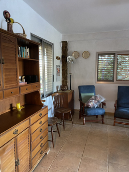
While some items were absolutely gorgeous, others were not so. But that's what you get, decades worth of stuff all accumulated in one country home. And stuff there was, Oh Em Gee LOTS of it. Here are some before pictures of the living room space now turned study / living.
As you can see, lots of wood. The Spanish way. Some gorgeous, some not so. Large chunky pieces of furniture, all built to last and placed purely for functionality and to house dozens of people. What I missed the most was texture. Everywhere I looked were hard surfaces. Granted, you live a lot of time outside, but inside simply wasn't inviting.
It has some awesome architectural features though; I am totally obsessed with the exposed stone. It even has an exposed brick wall, so I am feeling right at home! The fireplace rocks, and gives lots of heat in winter. However the walls were whiter than white, the lights brighter than bright, and the copious quantities of the artworks (some very questionable) were placed at random. The place wasn't sure what it wanted to be and needed a personality injection, and real fast too!
We work in Spain too
Hubby and I both work from Spain from time to time. Me in particular, have a fair few local projects on the go, which makes me have to be there. It also makes an office space a necessity. The desk was originally placed in the bedroom, which is not ideal. I decided I would divide the large living room into a multifunctional space, after clearing out all the unnecessary and unwanted furniture pieces and dodgy artworks.
First up, paint!
First up, paint! Paint instantly transforms a space. Even if colour isn't your thing, there nothing like a fresh coat of paint that hides a multitude of sins (in this case the 2453 holes in the wall, randomly placed, to hold even more random artworks). I wasn't a fan of the orange of the feature wall from the start, that had to go. Also, the room lacked a bit of definition. The outside of the house is pink, and I drew my inspiration from there. I picked a colour palette for inspiration from Pinterest for the entire house, and went from there.
On the colour wheel pictures you can see the two colours I picked for this particular space:
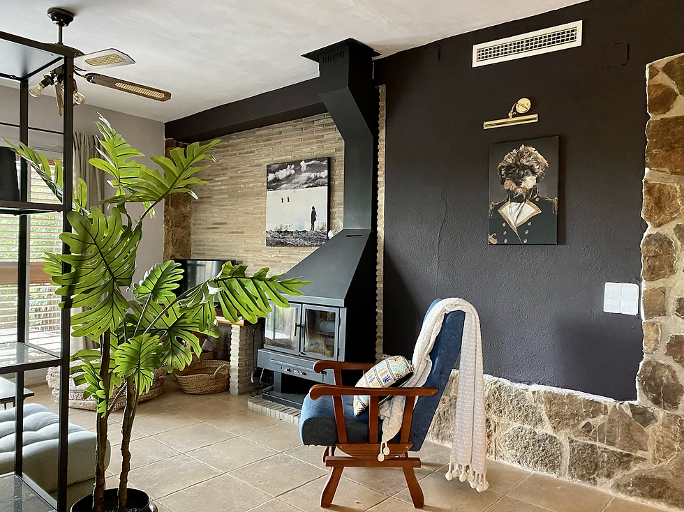
And then we got started! The house is built in a typical Mediterranean style. Super thick walls, little natural light (to keep the house cool in scorching summer temperatures) and popcorn texture everywhere. Takes forever to paint. And every morning as you wake up, you find specks of white you've missed. But we got there in the end! I decided to paint the feature wall the dark (nearly black) aubergine colour, as well as the bulkhead on the other side, to define the space.
First peek
I love combining vintage with modern. I discovered an old sewing machine and there was no question about it, it had to feature. Also the desk was great. I desperately needed, however, to take this space into the 21st century, adding some texture and infusing a bit of a modern vibe.
Via Martine
I had been following Via Martine for quite some time on Instagram. I love her style, her approach to her feed, her art and on top of that, we bonded over our mutual horrible experience of being hacked on Instagram.
A kindred spirit. Plus, and that was what sealed the deal, the use of a colour palette that exactly matched my choice for Villa Ardilla. It was the modern touch I needed for my study space in the country side. A perfect match with the vintage elements that were already there. Martine gave me a number of artworks to feature in Villa Ardilla and they all got a prominent spot.

Finishing touches
I added a dividing open cupboard in industrial style, curtains, an area rug to define the space, cool lighting, and simply rearranged the set up. Got the desk from the bedroom, created a special corner for the sewing machine, picked a chair that I could sit on the longest and created a study space we're both stoked to be working from. The view from the desk is the feature wall, the fireplace, the awesome masonry entry to the dining and the rest of the house and the quirky painting of our very own Diesel.

Tadaa! Some pictures of the finished space!


Whispering Bold goes Mediterranean; a bit urban, a bit chic, a touch of country, a little vintage and throwing in some modern industrial elements for good measure. Hard to pin point the exact style, but that's the way I like it. It's simply me. I've been working from this spot on and off now, and it certainly makes for productive days in the Spanish country side. I love it. Thank you Via Martine, to help me put the finishing touches on the styling.

So? What do you think? Would love to hear it!


